Friday, 31 October 2014

Ancillary Task Deconstruction 2/3

On this digipak, Katy Perry is featured prominently with over half the images being of her. This is used probably because she is a huge pop icon, recognisable world-wide and is a house-hold name. The images featured are all quite sexual in some form, with Perry either lacking clothes or showing skin such as cleavage. These photos are recognisably influenced by the lead single, 'California Girls', and the music video which features bright coloured candy, in turn making Perry seem quirky while maintaining the sultry image she hopes to have. The colour scheme is a mix of many colours (most just being ones that relate to candy and deserts), but the main four ad red, white, pink and blue. The white connotes to purity and innocence which is in contrast to the red which often represents romance and danger. However, the pink and blue can both signify youth as they are the colours often presented to babies at birth depending on their gender, again tying this in to the quirky image Perry wants of some candy world.

The use of candy throughout could be used to represent the sweet, innocent side of Perry that isn't often shown in the media due to publications about partying and her private life with her then-husband, Russel Brand. This could interest the audience enough into purchasing the CD to find a new style of music that reflects her and maybe what was happening at her life during the time. Likewise, the use of candy images on the two CDs may appeal to her younger audience through the use of colour and appealing


The other images used in the digipak has Perry in a dress, with each photo having her wear a different form of candy crown. This could give Perry a sense of authority over the listener as it reflects power onto her, reinforcing herself as an iconic pop star and an influence to many people. It could also be linked into the title of the album and lead single, 'Teenage Dream', due to appearing almost like a prom queen which is usually represented as the ideal fantasy for teenage girls, her target audience. The way her hair and make-up is done almost reflects a pin-up look, which could also represent the final song, 'Not Like The Movies', with "the movies" often being a dream for young girls back when the pin-up style was popular.


The only typography used is the track-listing and other information on the back, which may be because the imagery used for the CD itself is so iconic to Perry, people know it is her album so no title's or name is needed. The text itself is very bold and spacious, which makes it much easier for the viewer to read, again maybe targeting towards a younger audience. The font is both red and blue, using solid colours with a shine at the top of them to be visually appealing. Red and white circular candy is also used to replaces the 'O's in the words, reinforcing the theme of her CD.

Thursday, 30 October 2014

Ancillary Task Deconstruction 2/2


On this digipak, the Script is only used on one of the images, which is the box of the CD- this is probably so that the general public will recognise the CD as their's and not just their target audience. The images featured are quite reserved and basic while giving a sense of it being personal due to the people holding hands. It could be viewed that the use of darker colours is making it more private and intimate, something fans of the band would want to it feels like they connect with them when listening to the album. The fact that the owners of the hands aren't shown could also be viewed as making it accessible to everyone while keeping a sense  of intimacy, as they could be anybody's hands.

The CD, both front and back, gives a sense of unity to everyone and this is reflected in the title- 'Science and Faith'. The fact two drastically different things are coming together while two hands are touching & holding eachother reflects this message well, as it's two differing things coming together. 

The typography used it the Script's logo, title of the album and track-listing. All in a black font to stand out against the light-brown faded background they're on, they are much smaller than what a band would presumably put on. This could be so the main focus in the image of the hand, which would make the viewer curious as to what type of music would be on and to potentially find out more information about the CD and band. The box, however, has white font that is much larger than the one on the case; this may be to make up for the lack of advertisement of the band on the actual album, making it extremely clear who's CD it is.


The box on the digipak features an image of the band in a field, all looking off to the sides, presumably searching for something. This compliments the album well, as the audience my see that and wonder what they're looking for, then see the two hands holding and realise that the message is maybe for somebody else, for unity, and for intimacy. The album does this well, as it does not sexualise the band in any way, yet makes them desirable by playing on the audience's emotions.


The CD itself appears to have an atom on it, which could represent unity and life, too. The colour scheme seems to be reversed, with the majority of it being dark colours with a tiny bit of light because of the atom. I feel this is interesting and is something I might be interesting in doing.

Ancillary Task Deconstruction 2/1

On this digipak, Rihanna is featured heavily with all images featuring her face. This is used probably because she is a huge pop icon, recognisable world-wide and is a house-hold name. The images featured are all sensual and partially sexual without using her sexuality, having Rihanna pose with her eyes closed on all photos with clear posture that shows elegance. It could be argued that the use of red lipstick, red roses and the extent her red hair is shown off can represent romance and danger, as red connotes to these themes; however, red roses are mainly linked with only romance, so it gives the listener an idea of what the album will hold. The red colour scheme is bold, which fits well with the title of the album, 'Loud', as it would stand out on charts among other albums.

The extent her red hair is shown could be because at the time it was iconic for her, having started a trend among females of dying their hair red- this leads the reader to instantly recognise her influence and power, which could also be represented by her posture as she is facing down slightly, despite her eyes being closed, so she would be above the listener. Similarly, the theme for the digipak may be based on her widely publicised personal life as the theme seems to be love and potentially lust (based on her position, the colour scheme and the roses), which could lead the audience to want to buy the album to potentially find out more about her.

The only typography used is the title and Rihanna's name on the cover- this may be because that Rihanna and her label feel that she is so well-known, no other information needs to be given for a fan or wider audience to purchase the digipak. The text itself is very minimal and spacious, which makes the viewer focus mainly on the images in an attempt to make them feel how Rihanna intends, which is most likely curious. The CDs feature pale pinks roses which heavily contrast with the rest of the digipak's colour scheme of medium/dark shades of red. This continues the feminine colours and the overall theme of love and romance.

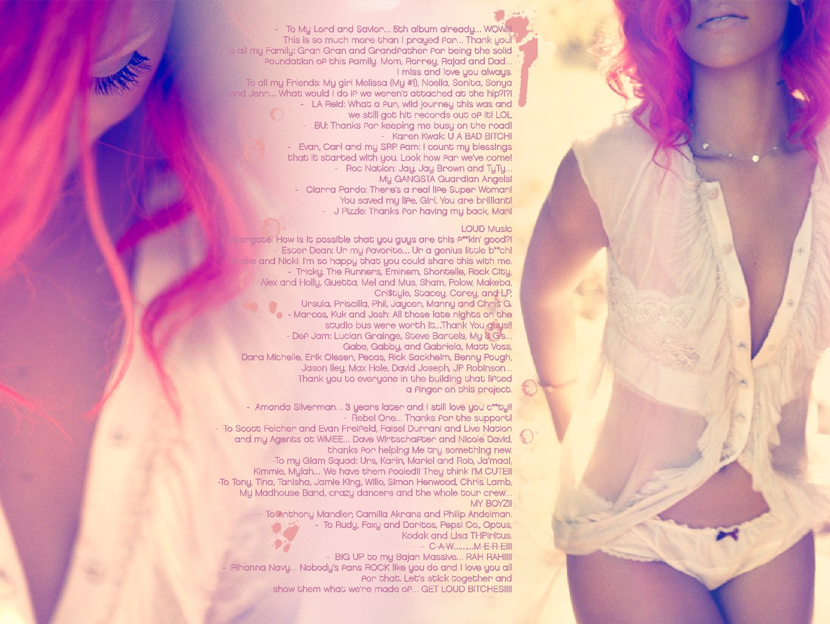
This part of the digipak features Rihanna thanking people who influenced her as a person, an artist and who influenced the album. She goes on to thank the people involved, with messages to significant persons and groups of people. This makes the reader feel as if they are seeing something private and personal, making them feel almost part of Rihanna's life. These images are provocative due to the position Rihanna is in and the amount of skin she is showing, but is also deeply personal due to Rihanna looking down and her hair covering her face. Due to her wearing white, it can lead the audience to believe there is a pure side to her which is reflected in the album, a side the media does not often represent.


The colour scheme is continued onto the back of the digipak, with pale pinks, shades of red and white being used to compliment eachother. The image used shows Rihanna as vulnerable due to her body language (sitting down, staring down, hair covering face, arms inbetween legs) which again can show a side of her the media neglects to show, and suggests to the audience that this is a side that will be reflected in some of her songs.

Wednesday, 29 October 2014

Ancillary Task Deconstruction 1/3


The advertisement features two images, however the main image is simply a zoomed in version of the other. They feature Gwen Stefani sitting on a throne, surrounded by luxuries. The colour scheme of the advertisement follows that of the album- white and gold. These colours may have been used to catch the attention of the reader as they clearly stand out to the reader, going from what would presumably be a page of text or a typical dark advertisement to a brighter one such as this. The gold is used to connote to royalty, money, luxuries and power, all that is represented by Stefani herself sitting on a throne with a fur-lined jacket.

The main image is a close-up of Stefani sitting on a warped throne. It includes digitally manipulated imagery of a crown and scepter, used to reinforce the image of royalty, money and power. This reflects the album completely as the idea of glamour and royalty is a clear influence on this particular cover, while stating a song called "Rich Girl" on the advertisement.

The largest font is Stefani's name in gold, used to stand out completely from the rest of the image to make it known to the reader who they are looking at, with the second largest font being the album's title so the reader also knows what's being advertised. The gold font stands out against the white, following the colour scheme of the album. The font type itself is dramatic period font, using extravagant drop-capitals used mainly in the middle-ages; this is again used to reinforce the 'royal' them of the album, as the middle-ages is known for the kings and queens. It could also be argued that because the font is sophisticated, it also makes the reader feel a sense of sophistication.

Below the main image and titles, it informs the reader about the famous singles included and the other famous artists that feature and have contributed towards the CD. The font gets smaller as it talks about the contributing artists, showing that Stefani is the most prominent figure and the most important artist on the album.  

Finally, at the bottom of all of this, links to a website about Gwen Stefanie. This is so a casual reader who is interested or a fan can find out more information about her, which may include a way to purchase the album, singles, tour dates, meet & great opportunities or other such things. This also includes the golden sophisticated font. In the bottom left corner beside it, a small photo of the album cover is presented to the reader, just being a zoomed out version of the main image, showing the full throne, Stefani's clothes and two dancers which shows her authority and power as they dance for her.

Ancillary Task Deconstruction 1/2

The advertisement features five images, but one is featured twice and then another time flipped. They feature the lead singer, the album cover and an image of the 7" picture disk. The colour scheme of the advertisement follows that of the album- red, black and white. These colours may have been used to catch the attention of the reader as they contrast well with each other, while giving the edgy rock vibe that the band aims for. The red itself connotes to violence, danger but also romance, cleverly used to represent the blood (violence), the grenade (danger) but the heart shape of the grenade (romance).

The main image is of Billie Joe Armstrong, lead singer of Green Day, picked as he is the most recognisable member of the band and has his own fan-following. It appears to be taken at a concert of some sorts as Armstrong stare into the distance while singing into a microphone, wearing black like the colour scheme. This reflects the band, genre of music and CD well as it represents the general rock feel they want for their band, while completely standing out (due to the white font and lighter background).

The largest font is both the band's name and the 'new' single- this is so people who may not recognise Armstrong by face immediately know who is being advertised. This suggests that Armstrong alone may not icon-enough for the aimed target audience. The white font clearly stands out against the grey background while also contrasting with the black theme in the image. The drastic change in font is also used in an attempt to make the band appeal to the rock-audience as it's edgy and stands out against the solid bold font of the band's name.

Below the main image and titles, it informs the reader about what is included within the album and the new singles. They advertise it as "The no.1 selling album", which may be used to influence the reader to find out more information about the album and become curious as to why it's sold so well. The colour scheme changes in the text, with the red highlighting what is deemed the most important information as well as the most appealing parts of the text, often highlighting "and" as red to make it seem like the offer is generous and desirable.

Finally, at the bottom of all of this, links to a website about Green Day and a charity (MakePovertyHistory) are shown. This is so a casual reader who is interested or a fan can find out more information about the band, which may include a way to purchase the album, singles, tour dates, meet & great opportunities or other such things. The inclusion of a charity is used in an attempt to influence the reader to support an act that the band itself presumably supports, while also coercing the reader to believe that purchasing an album, single, merchandise, tickets, etc. from the band will result in the charity earning money, making the reader feel good.

Ancillary Task Deconstruction 1/1

The only image presented on this magazine advertisement is Jessie J, using her album cover as the main inspiration for the advertisement itself. The dark make up itself represent the genre of the album, which is R&B, and follows the colour scheme of black, gold and a little bit of white (or maybe very pale gold). These colours may have been used to catch the attention of the reader as they contrast well, but gold also connotes to money, glamour and is generally viewed as desirable, which in turn can make the reader feel the need to buy the CD (or at least find out more).

Jessie J is in the centre of the image, obviously being the main focus for the reader due to her recognisable face because of her fame. She is staring into the camera and as such is staring at the reader, which may make them feel as if the advertisement is personal to them and feel some small form of connection or relationship to the artist. Her name is the largest font and directly in the centre of the page, standing out against her black clothes- this is so people who may not recognise her by face immediately know who it is. This suggests that she is so popular and in-demand that people don't need to know what's advertised to be interested if her name is on it.


Below the image and title, a previous song is referenced which is known world wide. This is so that if the reader is not familiar with the artist but just the song, they now know who sings it and where to find more like it. It also indicates that the album itself will contain more "#1 international smash" songs.


Finally, at the bottom of all of this, a website for Jessie J is presented to the reader. This is so a casual reader who is interested or a fan can find out more information about her, which may include a way to purchase the album, singles, tour dates, meet & great opportunities or other such things. This is also more appealing to the younger generation, which is presumably the target audience as the edgy look connotes to rebellion, as they are more familiar with the internet and technology, making it target-audience friendly.

Thursday, 23 October 2014

Pitch & Write-Up of Audience Feedback


The audience feedback to this pitch was largely positive. Most people loved the idea and said a strength was that we had planned it out so much and had a very detailed idea of what we wanted to do. A weakness that some people said was that if we had somebody singing with a guitar like we suggested, it may be hard to match up the lip-sinking with the actual song. One suggestion was that we use the studio, however we feel that while it would look more "professional", it would change the entire feel of the video and have decided against it.

Audience Research


Tuesday, 21 October 2014

Moving Image Planning

Media Production


Moving Image planning document


What emotional impact do you want your filming do have upon the reader? How?

I want my video to entertain my viewers. This will do this by making a story that is understandable and easy for the reader to follow as well as matching to the music we have chosen. The music is mainly about friendship so the main emotion will be happiness within a group of friends, the things they get up to when they hang out.


What personnel do you need? Who are you going to film?

I am going to need a group of 4-8 friends around the age of 18, a mixture of girls and boys.

-         Two Camera operator’s

-         Script writer

-         Director

-         Make up

-         Editors

-         Storyboard artists

-         Assistant camera operator


What props will you need?

For the props I will need;

- Wine bottles and glasses

- Acoustic guitar

- Torch


How are you going to emphasise colour?

Most of our filming is most likely to be done at night, so the lighting is going to be harsh which will create a heavy contrast between the light and dark. For most of the video the lighting is going to be dark.


What lighting will you need? Any other equipment?

I will need extra lighting as we are filming in the dark, so we need lighting in order to catch the scene on camera. We will be using naturally lighting outside when we’re filming in the day time. Depending on the scene we will be using torches as a light source as well as a prop for the characters to have.


Where will you shoot? Will you need a backdrop?

I am planning on shooting the music video in a number of locations.

-         House (house party)

-         The street (outside the house)

-          Newcastle city centre

-         Newcastle Quayside

-         CafĂ©

-         Restaurant

-         field


Make-up? Costume?

The dress is going to be informal, ‘typical teen’ look which could be described as jean jackets, boots.

Thursday, 16 October 2014

Mood Board


The Script's 'Millionaires' music video is a huge inspiration for my music video, since I'm using the song and similar imagery throughout mine.


Taylor Swift's 'Out of the Woods' would work well with my target audience as despite being based around a couple, it could be stretched to be about friends. The imagery of woods works well, too, since my video may have friends in the woods.


Paramore's 'Still Into You' would be listened to by my target audience as it is a general pop song that is widely known and catchy. By being in the Top 40, my audience will have listened to it.

Wednesday, 15 October 2014

Main Task Deconstruction 3


This is a music video from Birdy to her song, 'Wings'.  It features Birdy and her friends dressed in costumes, presumably at some form of party, dancing around rooms, fields and a large bonfire. The video uses the colours and strange outfits to enhance the atmosphere and give it an eery sense of strangeness and difference to a more standard party in society.

Camera: Many establishing shots are used in the music video, setting up the scene frequently and showing a wide range of the characters and their costumes used. These are used so the audience understands where the video has taken them as it cuts between rooms and outdoors, and showing the extent of the party from a wide angle. Quite often the video uses close-ups to show the detail of the costumes, the expressions of sadness on Birdy's face and the actions of the party-goers as they dance around and seem to have fun. Tracking shots are also used frequently due to the party-goers dancing and moving, as well as following Birdy walking through a corridor while playing with lights, so the viewers follow them as they move and feel a part of the video and involved. Tracking shots are also used to follow the movements in general which gets the audience feeling as if they are there within the music video and that the party is interacting with them. Quite often, zoom in and out are used to add the effect of the video being fast and slow paced at differing points and giving the general feel of excitement and yet also sombreness to the viewer.
Mise en scene: The party-goers are shown wearing rather dull colours (even when wearing white it's faded) which reflect well with the general colour of the video, as most of the light within it is low-key with a drastic use of shadows to reflect darkness. The low-key lighting used within the video is used to emphasise the overall dullness of the event as far as Birdy is concerned. Birdy herself wears the most colour, a shade of blood orange that makes her stand out from the crowd which signifies her as the main focus but can also represent her feeling isolated since she also doesn't interact with the crowd. However, as she later interacts with the crowd, she starts to become blended with the colours of them seeming to become more prominent while the video itself seems to get slightly blurred. Many of the costumes worn seem to be period-like, so that also being considered with the dull colours reflect well with the environment they're in which is dying fields and a worn-down house which also is decorated to seem like it's from a period in the past.
Editing: The editing uses straight cuts when transitioning from different clips, which should make the overall feel of the video fast-paced but due to the scenes actual being long and slow, the video itself is largely slow-paced.  Due to the transitions being seemingly random and not in time with the beats, it can throw off the audience and make them feel confused, which in turn could also make them focus more & pay more attention on the video. Slow motion is used many times within this (such as when the party-goers are dancing, Birdy walking, Birdy on the swing) which slows down the entire video but it also increases in speed at times when cutting between scenes to maybe distort the video and give a sense of confusion and wonder to the audience which may be reflecting how Birdy is feeling.

Tuesday, 14 October 2014

Main Task Deconstruction 2


This is a music video from Paramore to their song, 'Still Into You'.  It features the band dancing around multiple rooms and areas, using the colours and imagery to represent what it feels like to be in love to match the song lyrics. It includes them in a room full of blown up balls, riding around a house on bikes and dancing in fields with sparklers.

Camera: Close ups are used throughout the song, with Hayley Williams framed often in the centre of the shot, following conventions of the genre of music (pop) as the main singer is in the centre and therefore portrayed as the most important and valued member of the band. Quite often the video uses full-body shots to portray the entirety of the band. Tracking shots are also used frequently due to the band being on bikes, so the viewers follow them as they move and feel a part of the video and involved. Tracking shots are also used to follow the movements in general which gets the audience feeling as if they are there within the music video and that the band (mainly Williams) is interacting with them. Quite often, zoom in and out are used to add the effect of the video being fast paced and giving the general feel of excitement and entertainment to the viewer.

Mise en scene: The band are shown wearing pastel colours which reflect well with the general colour of the videos, complimenting each other well and connotes to the summer season which in turn also connotes to sun and general happiness. The high-key lighting used within the video is used to emphasise the overall fun and happiness of the video which reflects the meaning of it as stated above. Projection is used multiple times on the band members and the walls of different colours and lights which goes on to, again, reflect the colours used throughout the entire video.

Editing: The editing uses straight cuts when transitioning from different clips, making the pass of the video fast. Many of them transition in time with the music beats, changing when a certain beat plays. I feel that in general this is an interesting way to transition as it keeps the audience captivated by the music and overall makes the clip transitions more natural. Slow motion is used a few times within this (such as on the bikes and with the sparklers) which slows down the entire video but in time with the bridge slowing the song down itself. 

Thursday, 2 October 2014

Main Task Deconstruction 1

This is a music video from Phillip Phillips to his song, 'Gone, Gone, Gone'.  It features stuttering frames of home movie throughout the entirety of the song, interspersed with clips of Phillips going on a stroll at sunset.

Camera: Mid shots are used throughout the song, with Phillips framed to the left of the shot, which follows the rule of thirds as he is completely on one side of the screen- this makes it easier for the audience to focus on them but also gives them room to admire the cinematography shown in the background. Many of the the stuttering home movie frames are close-ups and extreme close-ups which show the detail on the faces and expressions, as well as the grain of the video which show the age of the home videos.

Mise en scene: Phillips is seen wearing a jacket and shirt, which goes well with his surroundings as it appears to be winter, so there's a sense of verisimilitude. The dark colours he wears contrast well with the sunset. The people shown in the home videos are wearing out-dated outfits, which reflects the time periods they were in. When playing an instrument in a room full of instruments, there is low-key lighting with harsh shadows being used which contrast well to the high-key lighting of being outside in the sunset. The video itself uses many glares from varying light sources, adding a certain brightness to the colouring of it which could capture the audience's attention due to the good cinematography.

Editing: The editing uses straight cuts when transitioning from different clips, often making the video seem to have a fast-pace when cutting between home video shots. Many of them transition in time with the music beats, changing when a certain beat plays. I feel that in general this is an interesting way to transition as it keeps the audience captivated by the music and overall makes the clip transitions more natural. The overall feel of the video is slow due to the slow movement of Phillips and the length of the shots where he is walking and playing his guitar, which contrasts to the fast-pace of the home video shots.